Posts Tagged 'art'


About Designer/Maker 1

Some contemporary craft professionals refer to their practice as designer/maker. Eight different models (designer/maker niches) of this approach to practice had been defined by Noris Iaonnou. (1) I like to add an other variation here, with a raised level of information literacy and competency, identifying today’s designer/maker practice. A literacy that goes beyond using email and ordering materials online, it will include administration, development, presentation, promotion and (partly) production of projects.

Much of the Design Arts degree at the Australian National University, School of Art is based on matching changes in craft practice, education and digital technology with the expectation of this contemporary designer/maker model.

The core of any craft practice has to be the skills of the maker in his/her respective field, using traditional processes and materials. If these skills are paired with ‘digital’ competence both hold great potential to inform each other and merge into a contemporary designer/maker practice.

Canberra based jeweler Cinnamon Lee can be seen as an example of this approach. She applies a series of technology based processes together with a high level of manual finishing to make unique rings only possible through the application of high-resolution rapid prototyping together with casting.

(1) Noris Iaonnou, ‘Old paradigms for new: designer-maker models and the dilemma of globalism versus regionalism’. pgs 23 -29
‘Designing Minds – Contemporary issues in craft, design and industry’ Symposium, University of South Australia, 2000

I wish I had known about this site earlier. The “Rare Book Room”.

Many of my posts share findings about two particular prints published in Albrecht Dürer’s 2nd edition of the Painters Manual 1538 (Unterweysung der Messung). In order to see these woodcuts in relation to their descriptive texts and their ‘context’ within the book, I had to travel to Melbourne, Nürnberg, Munich and Vienna.

I could have had a very good ‘preview’ of this book on the “Rare Book Room” site where a good quality, page by page, reproduction of the Manual is available.

On the intro page of this fantastic site it says: ‘The Rare Book Room site has been constructed as an educational site intended to allow the visitor to examine and read some of the great books of the world.’ And it is a pleasure to turn the pages of these special books.

You can see the two prints by Dürer I referred in some of my posts in the rare bookroom here:

The Draughtsman of the Lute and A draughtsman drawing a reclining woman.

My blogs about the ‘Lute’ print are:
‘Did Albrecht Dürer get it wrong, a surprise discovery in one of his prints’
‘Ist Albrecht Dürer ein Fehler unterlaufen eine überraschende Entdeckung in seinem Holzschnittes der Zeichner der Laute’
‘Further to Albrecht Dürer woodcut The draughtsman of the Lute’

My blogs about the ‘Reclining woman’ are:
‘A page out of Dürer’s own copy of the Painters Manual’
‘Male or Female? One of Dürer’s prints in the context of gender, feminism and other theories.’
‘Dürer lost in translation? German Klartext and English translation of one page of Dürer’s handwritten manuscript of his 2nd edition of the painters manual’

Dürer lost in translation? German ‘Klartext’ and English translation of one page of Dürer’s handwritten manuscript for his 2nd edition of the Painters Manual.

The image below shows a word-by-word and line-by-line ‘translation’ of Dürer’s handwriting in clear text. In this text Dürer describes the use of his illustration of the ‘grid system’ as a drawing aid. Please find a discussion about this illustration here. Below the image is the English translation by Walter L. Strauss (The Painter’s Manual, 1977, pge 435). I matched the line sequence of the English translation with the one of Dürer’s manuscript to allow for an easier comparison of the two texts. Please click on the image to enlarge and read the German Klartext.

Translation of Dürer's handwriting into German 'Klartext' by Gilbert Riedelbauch

Translation of Dürer

(Ektachrome Signatur: 4 L.impr.c.n.mess. 119, http://www.bsb-muenchen.de)
Please find more details about this page in my earlier blog here.

Walter L. Strauss’ translation:

1. There is yet another method of copying an object and of
2. rendering it larger or smaller according to one’s wish, and
3. it is more practical than using a glass pane because it is
4. less restricted. In this method one uses a frame with a grid
5. of strong black thread. The spaces or quadrangles should
6. be about two fingers wide. For scanning,
7. one must prepare a pointer whose height should
8. be adjustable to be at eye level, which is
9. marked ‘o’. Then place the object to
10. be drawn a good distance away. Move it or bend
11. it as you like, and view it from
12. level ‘o’ to ascertain that it is in
13. the proper position, so as to please you. Then
14. place the grid or frame between the object and the pointer.
15. If you prefer to use fewer spaces of the grid,
16. move it closer to the object. Check how many spaces of the
17. grid will be utilized to accommodate the width and height
18. of the object and then draw a grid, large or small,
19. on which you wish to draw. Now begin to scan the object with your eye -point
20. o- placed above the pointer, and where it points on the grid in the frame, mark it
21. off on the grid on your sheet of paper. It will be good, and it will be
22. correct. But if you prefer to drill a small hole into your scanner,
23. it will serve the same purpose equally well. I have drawn
24. this method below.
notice on the margin (+ on a sheet of paper or a panel)

My thoughts about this text:
As I pointed out earlier here this text appeared in the second edition of Dürer’s painters manual together with a preliminary sketch for the woodcut ‘A draughtsman drawing a reclining woman’. This second and extended edition had 22 additional illustrations. It was commissioned in 1538 by his wife Agnes and printed by his friend Hieronymus Formschneyder ten years after Dürer’s death.
Several ‘inconsistencies’ appear when comparing Dürer’s manuscript with the final printed version. Firstly he makes references to the ‘eye-point’ marked ‘o’ in lines 9 and 12. He shows this point in his sketch, however in the printed version the text still shows the ‘o’ but the final printed illustration does not.
Secondly the ‘gender change’ in the illustration itself. Dürer drew a male model in front of the artist while the printed version shows a female model. This printed version has given rise to much discussion. Please see earlier blog about this print.

sketch by Albrecht Durer for the woodcut print draughts man drawing a reclining woman

Sketch 1525?

Duerer's 'Draughtsman drawing a reclining woman' as published 1538

Print 1538

Male or Female? One of Duerer’s prints in the context of gender, feminism and other theories

Dürer drew a man not a women. See for yourself:

Duerer's own sketch

Duerer's preliminary sketch showing a man not a woman.

(The woodcut based on this sketch by Dürer’s appears ‘mirrored’ in the printed version as a consequence of the printing process. Ektachrome Signatur: 4 L.impr.c.n.mess. 119, http://www.bsb-muenchen.de )
Please find more details about this sketch in my earlier blog here.

This post intents to question the basis of some of the interpretations of the woodcut ‘Draughtsman drawing a reclining woman’ by Albrecht Dürer. This image has been used as the basis of discussions in the context of gender, feminism and post modernism. Below is the widely known image on which these discussions are focused:

Duerer's 'Draughtsman drawing a reclining woman' as published 1538

Duerer's 'Draughtsman drawing a reclining woman'

The following sentences are taken out of some of the texts, with links to the full text where they are quoted from:
Purdue University:
The result confirms our suspicion that vision exists in Dürer’s image as the scene of sexual possession. Dürer’s engraving presents us with a specular economy that sublimates touch into sight and dominance into art. And we, by implication, are present as a third party to these events….

Suny College at Oneonta:
The opposition between male culture and female nature is starkly drawn in this image; the two confront each other. The woman lies in a prone position; the pose is difficult to determine, but her hand is clearly poised in a masturbatory manner over the genital. In contrast to the curves and undulating lines of the female section, the male compartment is scattered with sharp, vertical forms; the draughtsman himself is up and is alert and absorbed. Woman offers herself to the controlling discipline of illusionistic art. With her bent legs closest to the screen, the image recalls not simply the life class but also the gynaeocological examination.

Even at Stanford University someone cannot help but to make a comment about this image:
A wooden frame covered with a grid of black threads, together with an eyepiece – represented here by a small obelisk – permitted an artist to replicate the scene before him onto a drawing surface ruled with a matching grid. We will repeat his demonstration in class. Nobody will be asked to undress.

Now my thoughts:
What leads me to question these readings is a handwritten text and preliminary sketch by Albrecht Dürer himself. I came across these sources while sighting an Ektachrome reproduction of one page in Dürer’s own copy of the 1st edition 1525 Painters Manual at the Bayerische Staatsbiliothek in München, Germany.
Please find more details about this sketch in my earlier blog here.

Dürer had planed further additions for the 2nd edition of his Manual. The sketch and descriptions were inserted as a loose leaf in a (his own) copy of the 1st edition.
Now what is interesting is that this 2nd edition was printed in 1538 ten years after his death, commissioned by his wife Agnes Dürer. As is obvious from this initial sketch that Dürer shows the artist drawing another man and NOT a woman.
In my view Dürer’s intention was how to best illustrate this particular drawing system – subdividing the picture plane in squares as reference areas to be reproduced on a drawing surface with the same number of squares.

That he used a human figure as a ‘subject’ in this print follows from his intense study and documentation of the human proportions he did at this time– also published after his death. In other illustrations about the use of drawing aids to achieve a realistic perspective, he had used a simple object, like a vase or more challenging objects eg a lute. In this image he uses the complexity of the human figure, especially when observed in such a way that it will display foreshortening; difficult to capture even for an experienced hand.

I have absolutely no problem in ‘taking a work of art’ to support one or another theory or point, but in this case I believe the authors of the texts above might have reached different conclusions if they would have known about Dürer’s own view as shown in the sketch of this so well known and discussed print.

There are further ‘clues’ in the text that he had written on the same page. I will post soon a transcript/translation in German and English from his handwriting.

A page out of Albrecht Duerer’s own copy of the Painters Manual

I visited several print-rooms in Europe in April this year in the hope to find evidence in support of my theory of the ‘misaligned perspective’ . (see earlier blogs: ‘Blog 1 English version’ , ‘Blog 1 Deutsche Version’ , ‘Blog 2’). Using funds from the Carrick Award, I saw original versions of the wood cut of ‘Man drawing a lute’ at the Germanisches Nationalmuseum (Nürnberg, Germany) and at the Albertina (Vienna, Austria) as well as high quality ‘Ektachrome’ slide at the Bayerische Staatsbibliothek (München, Germany) this slide held the biggest surprise for me, but more about this slide later.

In Nürnberg I was able to see a copy of the print in question as a single leaf (proof) and several (historic) books holding references to this print. In Vienna I got presented a copy of Dürer’s Manual which was cut at the margins and included also some drawings about medieval defense installations from an other book by Duerer. It was a special moment when these original Renaissance works were brought out of the vault and presented for close inspection.

Man drawing a Lute AD 1525

None of the works I saw at either location could provide me with any further inside about my theory. The senior curator at the Germanisches Nationalmuseum, Dr. Rainer Schoch, made me aware that the Bayerische Staatsbiliothek in München holds a copy of Dürer’s own copy of the 1525 Manual with handwritten comments and additions, an advice which let to very exciting new insides about this Manual.

My visits to Nürnberg and Vienna were prearranged so I could see the original artworks, however the visit to München was spontaneous with only a few hours to spend allowing not enough time to retrieve Duerer’s own copy of the Manual from the air conditioned vaults but I was able to sight an ‘Ektachrome’ reproduction of the page with ‘Man drawing a lute’. As this Ektachrome shows the book opened, two pages are visible. On the right side is the print of ‘Lute’ but the left page is covered by an inserted loose leaf with a hand written text and sketch by Dürer himself.

On this loose leaf he has described the use of an additional drawing system to achieve a perspective drawing. The published print of this sketch is usually referred to as the ‘(Daughts) Man drawing a reclining woman’ or in German ‘Ein Mann zeichnet eine liegende Frau’. It was printed in the 2nd edition – the 1538 edition of this Manual which was published by his wife, Agnes Dürer, 10 years after his death, it appears in a significantly altered version. Here is a low resolution of digital reproduction of this slide. I will blog a translation of the text and some further thoughts on Dürer’s sketch and its printed version in the near future.

One page out of Dürer's own copy of the Painters Manual

One page out of Dürer

Ektachrome Signatur: 4 L.impr.c.n.mess. 119 (http://www.bsb-muenchen.de) (I purchased a digital reproduction of this Ektachrome and have permission to publish it as part of my research)

I like to thank Frau Barbara Fellner for her assistance and her skillful navigation to make the findings in Munich possible.

Preparing for Highlights, 2

I just put together the prototype of a desk-lamp. This object uses polished stainless steel, ABS plastic (rapid prototyped parts), an aluminum tube coated with carbon fiber, laser-cut Perspex and 3 warm white 3 watt LEDs.

Computer rendering 1

Desk lamp computer rendering

For the first time I will use a net based producer for part of the making process. Most of the lamp’s head part – the laser cut Perspex – will be produced by Ponoko . A clever (company) setup that laser cuts and laser engraves materials based on ones own design. Ponoko’s well working website makes it easy to get started. From selecting the materials to producing the right file formats for cutting and/or engraving all is explained in easy to follow steps. I am eagerly awaiting the first shipment of the 2mm thin cross-sections for the ‘reflector’ part of the lamp’s head.

After modeling the lamp shade as a ‘solid model’ first in CAD (formZ) I then sliced it into the cross-sections, these sections were then imported into Adobe Illustrator and saved out in the right format for Ponoko’s processes.

Cross-sections for laser cutting

Before uploading the file to be laser cut, I printed and cutout the Illustrator outlines and put together a mock-up of the lamp shape to see if I like the design and to get an idea if the pieces fit together.

paper mock-up of the lamp's head of lasercut design

paper mock-up of the lamp

Computer simulated lamp head

Computer simulated lamp head

I also rendered a simulated view of the final head-piece as well as the whole desk lamp. I hope the final ‘real’ object will closely resemble this simulation.

prototype of desk lamp with paper shade

prototype of desk lamp with paper shade

What I thought was a good idea – and all the work that went into an object trying to make it work.

Responding to a call to participate in the APM (Accredited Professional Member) exhibition by CraftACT with the title Interior Exterior I decided to make a light object. This show will open on Thursday 18 September at 6PM. Taking the dualism in the title as a starting point I used a warm light (1watt LED) representing the interior and a cold white LED as its counterpart. Both lights are directed towards each other and shinning onto a slightly curved transparent screen. See image of a few preliminary drawings for this object.

This screen is the membrane separating the inner from the outer. At this screen the different light qualities mix or fuse. Interestingly you can see the cold white on the ‘warm’ side of the screen and visa versa.

However when I started to model the components for a simulation on formZ (CAD) it became apparent that ‘all that stuff’ I needed to hold the elements in place was distracting form the pure, initial idea. What are now little cubes housing the LEDs were various (failed) designs going from bad to hideous. Even the cubes I have now are somewhat a compromise. Also the base-box which is capped by two alu plates and a white rapid prototyped frame feels like a necessary compromise to me. It contains the switch, driver and an additional LED (360 degree), which illuminates the base lightly from the inside.

First I wanted the top alu plate to be in mirror-polish but this particular alu piece I used had too many inclusions creating the occasional streak in the otherwise polished surface. To hide these streaks I used the new high tech Ink jet printer at the ANU School of Art , it can print on anything up to 40 mm thick with ink. The ink is then cured (baked on) with UV light. (One of our staff printed on a room door). The pattern I got printed onto the alu was derived from a piece of white sandpaper scanned in then the image was inverted and finally a ‘chrome’ filter in Photoshop applied. I usually avoid filters and effects at all cost but this pattern seemed to be able to run from the interior to the exterior section of the object without problems.

Now that this object is together and shines when switched on it has grown a little on me, but still it is an object that is neither a lamp nor a sculpture. Maybe, if I find the right (friendly) term for it it will settle into its place. Materials: Aluminium, ABS plastic, LEDs. Dimensions: 100 x 100 x 95 mm

Preparing for Highlights, 1

This is the first of a series of blogs I intend to write about the development of light objects in the build up of my exhibition at Craft ACT (Canberra, Australia). For this exhibition I hope to have up to ten new designs developed. This show will open in early February 2009 under the title Highlights.

I just finished the first of these objects which takes advantage of new generations of high bright LED lights. The object shown here uses two 3 Watt warm white LEDs, waterjet cut stainless steel, rapid prototyped parts (in yellow) and carbon fiber tubes. Height 1035 mm.

The design is torch like with the intention to appear clear and slender. All elements are as thin as possible but strong as necessary. The tension of the bowed carbon tubes holds the lights in place while at the same time supply the electricity to the LEDs.

The main challenges with this piece was to source the right driver for the LEDs to achieve good brightness while maintaining a long lifespan. I used two Cree XR 3 Watt (Jaycar electronics no: ZD-0444) together with a driver (AA-0585) which automatically detects how many LEDs are there, 1-6 are possible on one of these drivers, this allows for a wide range of designs. The driver itself is connected to a 12 VDC 1 Amp power pack.

The electricity is picked up by the LEDs from the carbon-fiber tubes, the bowing of the a result of the ‘light fittings’ are wedged in place by pushing out the tubes. More then two could be fitted to this lamb (the driver would adjust automatically). The black round disk in the center of the yellow fitting in the image above is the LED’s heat-sink. Despite being very power efficient and producing ‘cool’ light these LEDs get hot on the back and need to have a heat sink to make sure they stay within their recommended working temperature 50 – 70 degree c. The shade is, for the moment, made from drafting paper.

The foot part holds the driver, switch and connections to the carbon tubes. I designed all yellow parts on a CAD program (form•Z) and then rapid prototyped on a Stratasys FDM machine in ABS plastic. I polished the stainless steel after it had been waterjet cut.

Further to Albrecht Dürer’s 1525 woodcut ‘Man drawing a Lute’ (The Draughtsman of the Lute)

While researching into the perspective relationship between the picture elements of this print (see earlier posts in English and in Deutsch) I noticed several ‘abnormalities’ in reproductions of this so well known work by Duerer. These abnormalities appear on paper representations and on digital images of this print. This post is to bring together these titbits.

In 2006 I was privileged to see originals of Dürer’s ‘The Painters Manual’, these splendid copies of this renaissance publications are held at the National Gallery of Victoria (NGV) in Melbourne, Australia. The ‘Man drawing a lute’ image is towards the back of these publication and is relatively small in size, 182 x 132 mm, rather like a postcard, the detail and the precisions of the lines however are impressive. The NGV, which very generously opened its archives for me, holds a large if not the largest collection of Albrecht Dürer’s graphic and print work outside Germany.
Duerer’s 1525 and 1528 edition of the ‘painters manual’ ‘Unterweissung’

Now to the abnormalities in the reproductions:
1.) The vertical ‘rift’ in the upper middle of the print.
The following image shows in its upper part the print as in the original publications, while the image in the lower part shows it with the ‘rift’.
gr-duerer-image-comparison.jpg
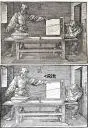
I found this distortion not present in the 1525 or the 1538 (NGV, Melbourne) editions but in many reproduction of images on the internet and in the following books, some declare to show ‘facsimile’ of Dürer’s print works.

Dürer today, pge 48
1970 and 1978 by Heinz Moos Verlag, Munich, ISBN 3-7879-0119-1
The Complete Woodcuts of Albrecht Dürer, illustration 338, Edited by Dr. Willi Kurth
1963, Dover Publication, New York, ISBN 0-486-21097-9
Albrecht Dürer, Les Gravures sur Bois
1978, Art et Culture, Paris, No d’impression: 5799

Initially I believed it to be a clue to help prove that Dürer (or the woodcutter) had made a mistake or change to the original print leading to the wrong relation of the perspective elements as discussed in earlier posts on this blog (see earlier posts in English and in Deutsch). But as I had to discover, while inspecting the almost 500 year old originals at the NGV, this distortion is not visible in the original editions. It seems to be an artefact from a later printing process of copies. The paper might have been ‘pinched’ at an early print run and subsequent copies and facsimiles have just helped reproducing this fault.

2.) The change in the quality of line.
Close inspection of the originals also showed a visible change in the quality of the line delineating the white space on the table below the open frame with the point drawing of the lute. This change is visible in all reproductions of this print. The weight or thickness changes at this location, some seem to run together with their neighboring line just as if they have been corrected or added later. And to support my theory (see earlier posts in English and in Deutsch), these ‘abnormal’ lines start where I suspect the frame should be placed in the composition of the print to make the perspective alignment of all elements right. Here is a crop of the highest resolution image I was able to find, which shows the changes in lines clearly.
Albrecht Duerer, Man drawing a lute, the draughtsman of the lute, Change of line, Riedelbauch
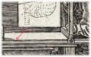
I found this image on ArtStore.

3.) ‘Pirate’ copy of this print
Duerer’s Pirate? copy of ‘painters manual’ ‘Unterweissung’
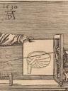
On ArtStore there are several digital images of Dürer’s ‘Man drawing a Lute’ print, one of them looks like it had been printed from a re cut woodblock. It shows ‘1530’ as date, two years after Dürer’s death !– the original had 1525 as date – and a sanitised point-drawing of the lute. Duerer’s work, very popular during his life time achieved respectable retail prices leading to illicit copies.

Finally, I found a little reference about a handwritten note by Dürer on the back of the 1st edition in Nuernberg on the back of this print. I love to know what he wrote, as it might shed some light on some of my questions I have about the composition of this work. This remark appears on page 266 in the 3rd of three volumes, this book focuses exclusively on Dürer’s book illustrations. These wonderful books, edited by Rainer Schoch, Matthias Mende and Anna Scherbaum, are the most comprehensive publications about Duerer’s print (Druckgraphische) work. I hope one day to be able to read Dürer’s note and to find out more about this significant print.

If you have any further information about this print by Dürer or any comment about my views of his work please get in touch.

Designer/Maker statement 1, Janet DeBoos

As I find it difficult to define the term ‘designer/maker’, the very core of our new degree (Design Arts) offer at the ANU, School of Art, I like to bring to this blog some of the short statements by my colleagues. These are taken from the de/sign/ed catalogue.

Approaching this term from different – in this case – individual points of view, will help forming a more complete definition. The first one of these statements is by Jannet DeBoos, head of ceramics.

My practice has always been centred on domestic ceramics, the processes by which it comes into being and the performative aspects of use by which it gets ‘remade’. I have since the mid 1980’s regularly exhibited work that presents these usually private acts publicly.

I have worked with other media (sound and video/film) to examine the nature of production, and with other materials (polystyrene and disposable plastics) to examine the way we use things. Since 1996 I have been involved in the examination of what is ‘lost’ (if anything) when domestic ceramics items are no longer handmade. (What if the importance of ‘handling’ is not in the making, but only in the use?).

In exploring these questions, I have become the ‘designer’ rather than the ‘maker’ in a collaboration with the Huaguang Company’s Bone China division (Zibo, PRC). This project is very ‘hands-on’ and I work closely with both the mould makers and factory workers as the pieces are produced, and adjusted. I have been particularly interested in the way that the change in material (porcelain to bone china) affects changes in the product, and how ‘design’ has created a resonance between the handmade and the factory ware.
Janet DeBoos sketch


images of work

categories